Build a Cinematic Fintech Hero Section With React, Tailwind, and Video Backgrounds
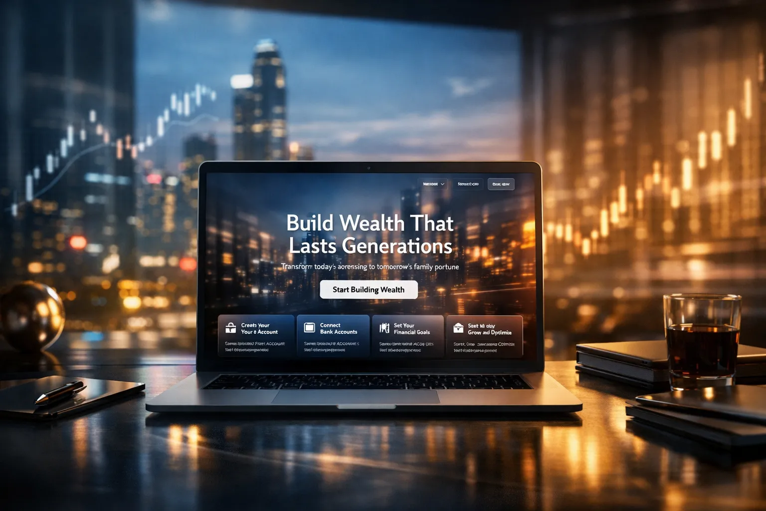
1) Full-Screen Hero + Background Video
• Hero section must fill the viewport: min-h-screen w-full relative overflow-hidden bg-black.
• Add a background video using this URL (must be used exactly):
https://d8j0ntlcm91z4.cloudfront.net/user_38xzZboKViGWJOttwIXH07lWA1P/hf_20260207_050933_33e2620d-09cd-43a2-80ef-4cdbb42f4194.mp4
• Video behavior:
• autoPlay, loop, muted, playsInline
• Video styling:
• visually scaled to 150%: scale-150
• focal alignment to top-left: object-left-top origin-top-left object-cover
• must cover hero area fully
• Add a subtle overlay layer on top of the video for readability:
• use a gradient + soft vignette (e.g., black → transparent → black)
• keep it tasteful, not heavy
2) Top Transparent Navbar (Absolute)
• Navbar must be absolute top-0 left-0 w-full z-20.
• Left: a white logo placeholder (text logo is fine, e.g., “Wealth.”) but styled like a real brand mark.
• Center nav links (white):
• “Features” with a small down chevron icon
• “Company”
• “Blogs”
• Right actions:
• “Sign in” as a subtle text link
• “Get Started” as a white pill button with black text
• Hover states: smooth opacity transitions; buttons get slight scale/brightness change.
• Mobile: collapse center links into a compact menu button (simple icon) but no complex drawer required—just show a minimal mobile layout that looks intentional.
3) Centered Hero Content (Primary Message)
Centered content container max-w-5xl mx-auto px-6 text-center z-20.
Tag pill (glassmorphic):
• Text: “Real-Time Budget Tracking”
• White text, subtle border, translucent background, blur.
• Should feel premium: rounded-full, thin border, soft glow.
Headline:
• Text: Build Wealth That Lasts Generations
• White, very large, responsive:
• mobile ~40–48px
• desktop up to ~96–104px
• Tight leading, modern tracking.
Subtitle:
• Text: Transform today's earnings into tomorrow's family fortune with proven wealth-building strategies
• White with slight transparency.
• Constrain width for readability.
Primary CTA:
• White pill button, black text: Start Building Wealth
• Hover: subtle scale-up + shadow.
• Include a secondary, quieter text link under it like “See how it works” (no underline by default; underline on hover). Keep it minimal.
4) Bottom Floating Features Grid Card
• Place a floating glass card near the bottom of the hero (still inside hero section).
• Must look like a premium “feature steps” tray:
• bg-black/70
• backdrop-blur-xl
• thin white border border-white/15
• rounded-2xl
• subtle inner highlight (very faint)
• Grid: 4 columns on desktop, 2 on tablet, 1 on mobile.
• Each column contains:
• a small step label (01–04) or icon dot
• a bold title
• a short description (provided below)
Use these exact titles + descriptions (clean up truncation but do not change meaning):
1. Create Your Free Account — Sign up in seconds using your email address or mobile number.
2. Connect Your Bank Accounts — Securely link your bank accounts, cards, or digital wallets.
3. Set Your Financial Goals — Customize your savings, spending, or investment goals with ease.
4. Track, Grow, and Optimize — Watch your money work for you in real time with insights and tips.
5) Unique Twist (Make It Feel “Alive” Without Being Gimmicky)
Add one subtle, high-end interaction:
• A “live status” micro-indicator near the tag pill:
• tiny pulsing dot + text like “Live”
• keep it very subtle (opacity pulse)
OR
• A gentle parallax shift on the background video overlay tied to mouse movement (very small range, accessible fallback on touch devices).
No heavy animations. No distracting movement.
6) Quality Requirements
• Must be pixel-clean and feel like a real fintech landing page.
• Add accessibility:
• proper button semantics
• focus rings visible
• nav links keyboard accessible
• Ensure contrast and readability over video.
• Output: complete React component with Tailwind classes, ready to paste into a React app.
Return only the code for the component.
Programming Languages
Tags
Purpose & intent
This hero section is designed to communicate trust, scale, and technical maturity within the first few seconds. The background video functions as ambient motion, while the glass UI and typography signal long-term stability—essential for fintech and wealth platforms.
The objective is clarity over spectacle.
⸻
Technical design principles
• The video layer should remain purely presentational, never intercepting input or reducing readability.
• Glassmorphism is implemented using native CSS and Tailwind utilities to avoid performance-heavy filters or libraries.
• All motion relies on GPU-friendly properties (opacity, transform, filter) to prevent layout reflow.
⸻
Implementation tips
Video handling
• Always include playsInline to ensure autoplay works on mobile.
• Use object-cover with controlled scaling instead of resizing the video source.
• Consider mobile fallbacks if bandwidth is a concern.
Overlay strategy
• Use a layered gradient overlay rather than a single opaque layer.
• Darken edges slightly to guide focus toward the center content.
Component structure
• Separate layers clearly:
• background video
• contrast overlay
• content + navigation
• This improves maintainability and future theming.
Accessibility
• Maintain visible focus states for keyboard users.
• Respect prefers-reduced-motion when adding subtle parallax or hover effects.
⸻
Common pitfalls
• Over-animated glass effects that hurt performance
• Text contrast that fails over bright video areas
• Heavy JS animation where CSS would suffice
⸻
Extensibility notes
This hero can be extended without structural changes to support CMS-driven content, dynamic feature grids, theme tokens, or server-side rendering (Next.js).
⸻
Final reminder
This section should feel engineered, calm, and deliberate.
If it loads fast, reads clearly, and never draws attention to its own effects, it’s doing its job.
Save Prompt