Build an Adaptive Landing Page That Changes Based on User Behavior
This is not a static marketing page.
This is a reactive product surface that subtly changes based on how a visitor behaves.
The outcome should feel like:
• the page is paying attention
• the product understands curiosity vs hesitation
• the UI adapts without being obvious
Think: calm intelligence, not gimmicks.
⸻
🧠 Core Concept (Unique Twist)
Instead of funnels or popups, the page uses micro-signals to adjust itself:
• Scroll speed
• Time spent hovering
• Sections revisited
• Pauses without interaction
Based on these signals, the page rearranges emphasis, not content.
No modals.
No chat widgets.
No aggressive CTAs.
⸻
🧩 Required Page Sections
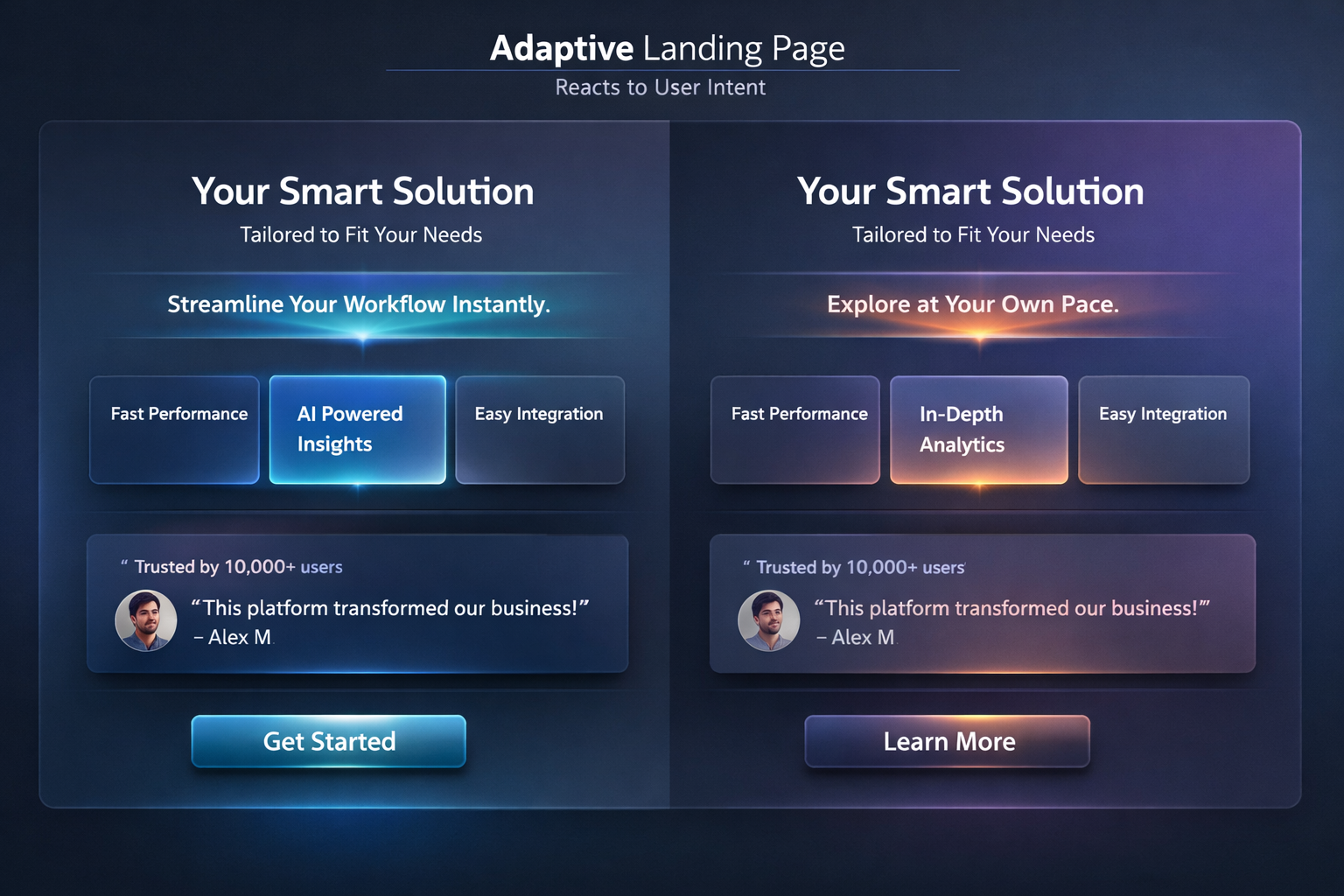
1️⃣ Hero Section (Adaptive, Not Static)
• Headline stays the same
• Subheadline subtly rewrites itself based on user behavior:
• fast scrollers → concise, confident copy
• slow readers → explanatory, reassuring copy
No reloads.
No animations calling attention to themselves.
⸻
2️⃣ Feature Stack (Reweighted, Not Reordered)
• 3–5 feature cards
• Cards gently change visual weight:
• opacity
• glow
• emphasis
The most “interesting” feature floats forward without moving position.
⸻
3️⃣ Proof Section (Contextual)
• Testimonials, stats, or quotes
• If user hesitates, proof becomes more visible
• If user moves confidently, proof fades slightly
No numbers changing.
No counters.
Just presence.
⸻
4️⃣ CTA Zone (Soft Commitment)
• One primary action
• Language adjusts based on confidence level:
• confident → “Get started”
• hesitant → “See how it works”
Never show urgency language.
⸻
🎨 Visual Language (Lovable-Friendly)
• Soft gradients
• Gentle shadows
• Rounded but not bubbly
• Calm motion (opacity, scale, blur)
• Neutral, adult color palette
• Dark + light mode compatible
This should look like a modern startup prototype, not a demo toy.
⸻
🛠 Lovable-Specific Requirements
• Built entirely inside Lovable
• Uses Lovable’s interaction and logic tools
• No external scripts
• No backend required
• All behavior driven by frontend state
• Easy to duplicate and remix
Include clear logic labels like:
• user_confidence_score
• engagement_level
• attention_weight
⸻
🧪 UX Rules (Do Not Break)
• The user should not notice the page changing
• No surprise animations
• No distractions
• Everything feels intentional and respectful
If the user notices the adaptation, it’s too much.
⸻
📦 Final Output Expectations
Deliver:
1. A fully functional Lovable landing page
2. Clear structure and labeled logic
3. Short explanation of:
• what signals are tracked
• how they influence the UI
4. Notes on how to adapt this pattern for:
• SaaS
• AI tools
• Creator products
Optimized for LLMs
Tags
What this prompt is really testing
This prompt explores how landing pages can adapt to user behavior signals instead of relying on static funnels, popups, or aggressive CTAs.
The goal is not conversion hacks, but calm intelligence—a page that subtly shifts emphasis based on how someone engages.
Think of it as a prototype for:
• smarter product marketing
• AI-aware UX
• next-gen landing pages that feel respectful, not manipulative
⸻
Ideal use cases
• AI tools and SaaS landing pages
• Startup demos and pitch prototypes
• Product discovery experiments
• Founder-led product sites
• Design systems exploration in Lovable
⸻
Tips for best results
Tip 1: Keep changes subtle
If users notice the page adapting, it’s too much. Favor opacity, spacing, and emphasis over movement.
Tip 2: Track behavior, not identity
Use anonymous signals like scroll speed, dwell time, and hover patterns. Avoid anything that feels invasive.
Tip 3: Let one signal win
Do not react to everything. Pick one dominant signal (engagement or hesitation) and base decisions on that.
Tip 4: Maintain layout stability
Avoid layout shifts. Adapt weight, tone, and presence—not structure.
⸻
Common issues & quick fixes
• UI feels “jumpy”
Reduce update frequency or add small delays before state changes.
• Adaptation feels random
Log or visualize your internal confidence/engagement score while testing.
• Too many states
Limit to 2–3 behavioral modes (curious, neutral, hesitant).
• Hard to debug logic
Temporarily surface state labels like engagement_level or confidence_state during development.
⸻
Philosophy reminder
This page should feel like it’s listening, not selling.
If it feels pushy, you’ve broken the prompt.
Save Prompt